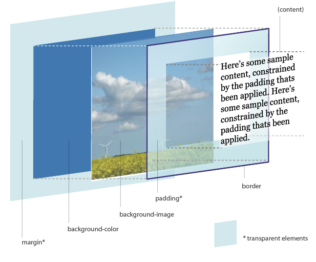
Here is the diagram for reference (released under a Creative Commons licence, © Hicksdesign 2002-11).
Everything in CSS is treated as a rectangular box, even inline elements (or at least they are a series of boxes). This is easy to demonstrate. Add some code like this to your css/html:
span.example {
	background-color: #ff0000;
	        color: #0000ff;
}

Some text <span class="example">containing some more</span> text.
It should produce this: some text containing some more text. Spot the box. Note, howver from here on in we are concerned with block level elements like h1, p and most especially div.
The best way to understand the basic of the box model is to look at a picture. The best one I have seen is at http://www.hicksdesign.co.uk/boxmodel/. It also inspired this fancy interactive 3d model. Go look at them NOW and then come back here. Get it? Cool.
Here is the diagram for reference (released under a Creative Commons licence, © Hicksdesign 2002-11).
 Here is some text and xx here is some more text.
margin-top or
margin: 0 0 0 0
width, height, padding and margin can all be set with relative or absolutes values. e.g. px or %.
Position is one of static, fixed, relative or absolute. Static is the default.
postion:static Static blocks are flowed normally: e.g. in the order they appear. They are not effected by any other positional parameters e,g. top etcpostion:relative Elements wth position: realtive are dispalced from their normal postion by the about defined by top bottom left right. They are commonely used to set containig blocks. postion:absolute Sets a postion relative to its containing block if that block is not static. Often this is the html block so you can use this to postion things on a fixed position in a page (or other containing block).background-postionworks in the same way so you can use it to postion a background image (the rest will be filled with background-color.postion:fixed. This fix a position relative to the viewport i.e. browser window. Elements with this never scroll but stay in place. Often used for headers etc. background-attachment: fixed works in the same way.
float controls how text and other elements float around a block.
float:left pushes an element as far left as it will go causing text to flow around it to the right.
float:right the opposite

IMAGE FLOAT LEFT Lorem ipsum dolor sit amet, consectetur adipiscing elit. Proin lobortis diam sed nunc pretium a vestibulum velit pharetra. Integer molestie vestibulum tincidunt. Fusce non risus non ligula imperdiet adipiscing. Mauris molestie, nulla at vulputate hendrerit, ligula turpis lobortis sapien, id venenatis mauris nisl a nisi. Aenean dolor odio, mollis sit amet facilisis et, ultricies a felis. Fusce semper venenatis rhoncus. Maecenas feugiat metus sagittis magna scelerisque et mollis leo lobortis. Nam gravida rhoncus leo, eu tempus eros tempus eget. Fusce massa purus, convallis aliquet ultrices aliquet, gravida ac mi. Duis ut malesuada turpis. Nullam lacus eros, pulvinar vitae tristique ut, adipiscing id leo. Sed sit amet dui turpis, in sollicitudin magna. Morbi et nisi ut quam porttitor consequat non eu ligula. Vivamus volutpat faucibus quam sed laoreet. Nulla posuere sem urna. Cum sociis natoque penatibus et magnis dis parturient montes, nascetur ridiculus mus. Vestibulum ante ipsum primis in faucibus orci luctus et ultrices posuere cubilia Curae;
IMAGE FLOAT RIGHT
 Lorem ipsum dolor sit amet, consectetur adipiscing elit. Proin lobortis diam sed nunc pretium a vestibulum velit pharetra. Integer molestie vestibulum tincidunt. Fusce non risus non ligula imperdiet adipiscing. Mauris molestie, nulla at vulputate hendrerit, ligula turpis lobortis sapien, id venenatis mauris nisl a nisi. Aenean dolor odio, mollis sit amet facilisis et, ultricies a felis. Fusce semper venenatis rhoncus. Maecenas feugiat metus sagittis magna scelerisque et mollis leo lobortis. Nam gravida rhoncus leo, eu tempus eros tempus eget. Fusce massa purus, convallis aliquet ultrices aliquet, gravida ac mi.
Duis ut malesuada turpis. Nullam lacus eros, pulvinar vitae tristique ut, adipiscing id leo. Sed sit amet dui turpis, in sollicitudin magna. Morbi et nisi ut quam porttitor consequat non eu ligula. Vivamus volutpat faucibus quam sed laoreet. Nulla posuere sem urna. Cum sociis natoque penatibus et magnis dis parturient montes, nascetur ridiculus mus. Vestibulum ante ipsum primis in faucibus orci luctus et ultrices posuere cubilia Curae;
Lorem ipsum dolor sit amet, consectetur adipiscing elit. Proin lobortis diam sed nunc pretium a vestibulum velit pharetra. Integer molestie vestibulum tincidunt. Fusce non risus non ligula imperdiet adipiscing. Mauris molestie, nulla at vulputate hendrerit, ligula turpis lobortis sapien, id venenatis mauris nisl a nisi. Aenean dolor odio, mollis sit amet facilisis et, ultricies a felis. Fusce semper venenatis rhoncus. Maecenas feugiat metus sagittis magna scelerisque et mollis leo lobortis. Nam gravida rhoncus leo, eu tempus eros tempus eget. Fusce massa purus, convallis aliquet ultrices aliquet, gravida ac mi.
Duis ut malesuada turpis. Nullam lacus eros, pulvinar vitae tristique ut, adipiscing id leo. Sed sit amet dui turpis, in sollicitudin magna. Morbi et nisi ut quam porttitor consequat non eu ligula. Vivamus volutpat faucibus quam sed laoreet. Nulla posuere sem urna. Cum sociis natoque penatibus et magnis dis parturient montes, nascetur ridiculus mus. Vestibulum ante ipsum primis in faucibus orci luctus et ultrices posuere cubilia Curae;
clear:ileft| right|none|both is used when you don't want something to flow around soemthing else. It pushes it clear of other elements.
z-index:[number] controls vertical stacking: the highest number goes on top
overflow:visible|hidden|scroll|auto|inherit determines what happens to stuff that would be dispalyed outside a blocks area
display: none| inline| block causes block elenets to act as inline or vice versa. Can also hide stuff.
visibility: visible| hidden
min-width etc.
Negative values for margins can be used to push the contents of a block outside of itself. Float:left can be used with li to make hotizontal menus. line-height can also be used when postioning to squeze thingswhere they wouldn't normally go. Remember everything can have a background this is useful for faxing full-height colums etc. Putting colored 1px borders ({border: solid red 1px;}) on divs etc is useful for figuring out what is going on.